The image below is from the WHO, and I don’t like it.
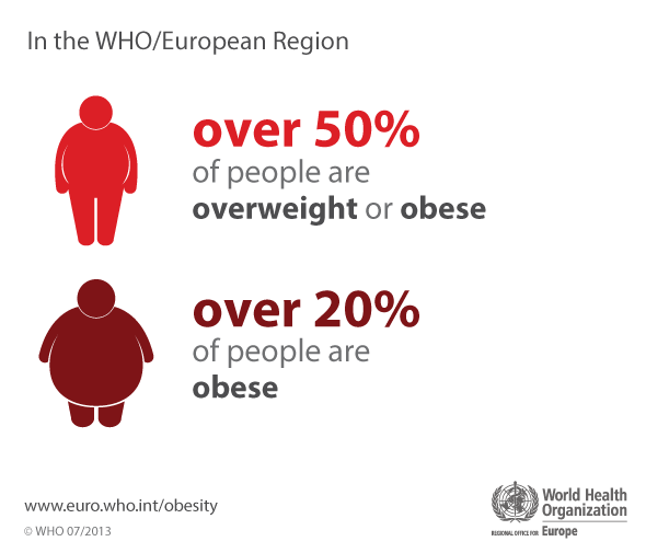
The top figure represents both overweight and obese people. According to the WHO, a person with a body mass index (BMI) of 25 or greater is overweight, while a person with a BMI of 30 or more is obese. The WHO arrived at these numbers partly due to research comparing health outcomes across people with different BMIs. These studies produce graphs like this one, which looks at mortality rate as a function of BMI.
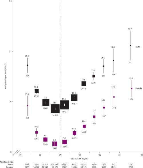
Risk of death starts to rise rapidly as BMI increases beyond 30, thus the WHO definition of obesity. But what about a BMI of 25, which the WHO defines as overweight? Your risk of death is almost as low as it can go!
Having a BMI of 25.7 is clearly very different than having a BMI of 33.1 in terms of health risks. So why do we so often see prevalence figures for obesity and overweight combined, as they are in the infographic above? Because it results in a bigger number, which makes your problem sound more important. Cynical, but true.
I am an obesity researcher, and I think it’s important to draw attention to the problem, but we need to be careful and honest about how we do it. If I am a healthy person with a BMI of 25.5 and see this infographic, I’m probably scratching my head looking at that first figure, who has a BMI of about 42 by my estimation. Then I’m probably ignoring everything else I ever hear about the dangers of obesity, because I know that I’m not anything like that thing.
This is unfortunate, because knowing you are overweight is useful, despite the fact it isn’t strongly related to poor health. This is because many people gain fat slowly across adulthood, and few experience sustained fat loss. As you continue to gain beyond a BMI of 25, health risks increase, slowly at first, and then more rapidly. Thus overweight is like a yellow traffic light, warning you that the path ahead is risky. It would be great if people better understood this, but in my opinion infographics like the one above undermine this understanding. (Side note: this perspective is very clearly outlined in a 1995 technical report from the WHO on anthropometry. Just scroll down to the section on overweight adults.)
Now what if I have a BMI of 32 (which is about right in my case) and see this infographic? Again, I’m looking at that bottom figure and completely discounting that it has anything to do with me. It’s ridiculous, it’s fat shaming, and it’s likely counter-productive.
What would I like to see instead? If I had the skills to make a decent infographic, I would start with the BMI/mortality graph above, add some traffic lights, and depict a person traveling along the path from better to poorer health as their BMI increases. I would also make sure to emphasize the health risks and other costs of morbid obesity which is becoming all too common in many places.